
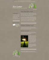
Announcement email- Targeted toward a younger audience the playful graphics and text caught my attention. The light background complements the graphics. 2 column layout makes it easy to decipher content from navigation.

Newsletter- This humorous black and white pig illustration caught my eye on this one.

Foreign Press Release Email- Catchy, creative two tone graphics and type treatment with 2 column layout.

Quick Announcement Email- The grungy etched illustration immediately catched my eye. All content is straight to the point nice hierarchy in text.

Quick Announcement Email- This email caught my attention with its texture usage. The bean bag gives it a more "Real" feeling. I'd say target audience early 20's to late 60's. Message promotes coffee for everyone with their tag line, and depicts it with their hand writing based type. As if they are leaving you a note.

Quick Announcement Email-
Even through bananas you still see Nike. Target Audience Athletes of all sorts,

Catalog Email- The graphic treatments caught my attention in this email. Phone fading gives the illusion of speed and movement. The wood treatment gives good contrast between, logo, content and additional info.

Newsletter- Love the color and graphic treatment in this newsletter. Even tho its a one column layout there isn't an overpowering amount of text, so it works. Target Audience would be Photographers looking to use there program to manipulate photos.

Quick Announcement- nice color usage, imagery creates hunger. There's no busy content overpowering the message. Target Audience- Family's or Catering Events,
Newsletter- cute graphic treatments that doesn't overpower or take away from the newsletter. clean 2 column layout making content and navigation clear.

Quick Announcement- I appreciated all the negative space in this email. Catches your eye, without taking away from the text. Target Audience would be any home or business owners probably around mid 30's early 50s.


 Wire Frame for my Html Email. I am creating an Announcement email as a portfolio piece for a logo I created for a wine tasting company"Vine Wine". This piece will be promoting a new type of wine this company makes. The secret ingredient is Honey. The main image will be of a bee flying on top of a winebottle with the caption "Just giving the grape a little competition." The Image will be hand illustrated. The box beneath the main image will contain a little information on the origin of honey wine. along with a caption of the new bottle. The footer is for the standard opt out info. Target Audience would be any one 21 and up and those whom may wish to host an event with their wine.
 Vine Wine Tasting- A logo I created for a wine tasting company in Naperville.
  Announcement email- Targeted toward a younger audience the playful graphics and text caught my attention. The light background complements the graphics. 2 column layout makes it easy to decipher content from navigation.
 Newsletter- This humorous black and white pig illustration caught my eye on this one.
 Foreign Press Release Email- Catchy, creative two tone graphics and type treatment with 2 column layout.
 Quick Announcement Email- The grungy etched illustration immediately catched my eye. All content is straight to the point nice hierarchy in text.
 Quick Announcement Email- This email caught my attention with its texture usage. The bean bag gives it a more "Real" feeling. I'd say target audience early 20's to late 60's. Message promotes coffee for everyone with their tag line, and depicts it with their hand writing based type. As if they are leaving you a note.
 Catalog Email- The graphic treatments caught my attention in this email. Phone fading gives the illusion of speed and movement. The wood treatment gives good contrast between, logo, content and additional info.

 Newsletter- cute graphic treatments that doesn't overpower or take away from the newsletter. clean 2 column layout making content and navigation clear.
 Quick Announcement- I appreciated all the negative space in this email. Catches your eye, without taking away from the text. Target Audience would be any home or business owners probably around mid 30's early 50s.


